When this project kicked off in January 2023, Dr. Praeger's hadn’t been updated in more than 8 years. During that time, numerous changes had taken place in the market and on shelves.
Since packaging is our most important communication vehicle, the design needed to work harder to capture attention, drive interest and motivate behavior. What could we do to make our brand stand out on shelf and attract new customers?

The time was right for a brand refresh with the goal of creating packaging that was stop-able, shop-able, and own-able.
I was the lead point of contact for all stages of this year-long project. After a kicking off with RFPs and agency presentations, CBX, an award-winning branding strategy and design agency, was selected. A combination of brand equity research and insights into current packaging trends led to several rounds of logo, tagline and packaging design development. As the leading designs went through qualitative and quantitative studies, one approach rose to the top both with consumers and company stakeholders.
We now have a logo that balances the inherent seriousness of “Dr.” with an organic feel and flourishes that feel fresh and playful. The rich dark green is now our own-able brand color. The tagline "Tasty meets Veggie" gets to the core of what we do — Dr. Praeger's makes delicious food that happens to be packed with veggies — and will inform all marketing campaign strategies.
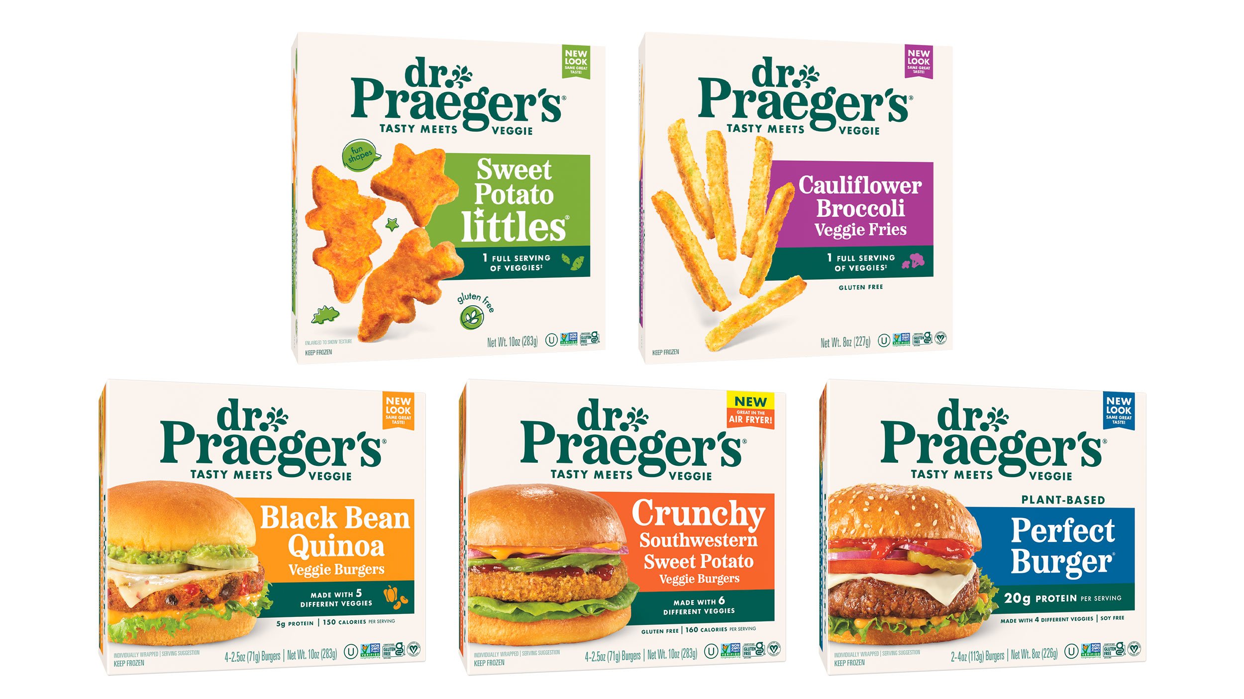
The new design checks the boxes on all we set out to achieve:
Brand name visibility
Clean, modern design
Clear information hierarchy
Communicates great taste
Unified brand block across SKUs
Plus, subtle callbacks to the previous packaging — light background, product name color blocks have made it easy for current fans to find the Dr. Praeger's products they know and love while attracting new customer to the brand.
For the launch of our Grillhouse Burger in 2024, we set out to establish them as a distinct sub-brand. Our goal was to create strong shelf impact and clearly differentiate them from existing products through a bold design approach. We also introduced a new box shape that can be displayed both vertically and horizontally, giving retailers greater flexibility in how the product appears in store while maximizing visibility.
Our packaging design architecture has proven highly flexible. For Costco U.S. and Canada, we utilized plated food imagery and emphasized the name over branding to clearly communicate the product and the eating occasion, helping shoppers who may be less familiar with the brand to quickly understand their appeal.